

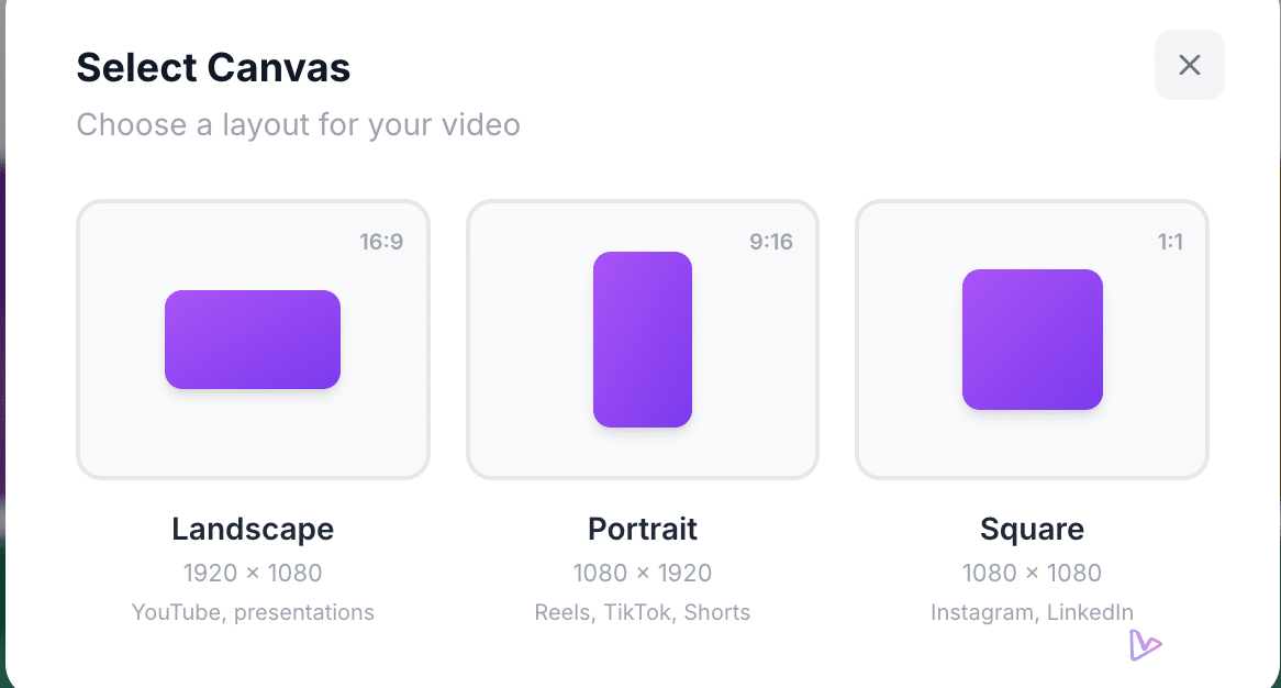
Take a single source — a product PowerPoint, a blog post or an onboarding document — and generate three distinct videos ready for YouTube, social stories and the feed without rebuilding the story from scratch. In vidBoard you upload the source, the editor structures it into scenes, writes or uses your narration and then produces an editable project that delivers landscape (16:9), portrait (9:16) and square (1:1) outputs. Crucially, each orientation gets its own layout: nothing is merely cropped out of a master video.
Why landscape, portrait and square need different design decisions
Each orientation has different visual real estate and viewing context. Landscape is wide and suits longer narratives, screenshots, slides and multi-column layouts; portrait is tall and favours stacked content, single-column headlines and bold visual anchors for quick consumption; square sits between the two and is common in in-feed placements where centre-weighted composition reads best.
Those differences are not cosmetic. A headline that sits neatly beside an illustration in 16:9 may collide with other elements in 9:16. A data chart that works on a wide slide can become unreadable if simply scaled down. vidBoard’s editor recognises this constraint: templates and layouts are available in all three orientations and adapt to the chosen aspect ratio rather than cropping a single master video. That means text, images and data widgets are reflowed to preserve hierarchy and legibility for the viewer’s device.
Adaptive layouts keep the message, cropping loses it
Cropping a single landscape master into portrait or square is fast, but it’s also destructive. Cropping removes context: labels, callouts, chart axes and side notes can be clipped away or reduced to the point of illegibility. An adaptive layout treats each scene as a flexible canvas: the same fact, quote or stat is kept, but its placement, scale and timing are adjusted so it reads correctly for that orientation.
vidBoard supports this approach in three concrete ways. First, the template library includes roughly 129 designs with every template available across landscape, portrait and square; AI fill adapts the design to your topic and orientation. Second, text and objects are editable on the canvas — you can drag, resize, change fonts and adjust timing so an important statistic stays visible where it belongs. Third, the Brand Kit applies your colours, fonts and logo automatically to every generated variant, so visual consistency is preserved across formats without manual rework.
How a single project becomes a multi-channel campaign without extra risk
The practical result of adaptive layouts is lower cost and higher quality at scale. Start from a document, deck or link — vidBoard reads the real facts and splits content into scenes — then let the AI create a first draft. From that editable master you can produce three outputs that are tailored to their channel contexts:
- Landscape for longer-form places like YouTube: wider compositions, full slides and embedded screenshots.
- Portrait for short-form social stories and reels: stacked content, larger type, bold imagery and concise captions.
- Square for in-feed posts: centred compositions and concise visual hierarchy that perform in mixed layouts.
Because everything remains editable, you can tweak a single slide and regenerate that scene without rebuilding the whole video. Per-object timing and entrance/exit animation controls let you tailor pacing for each format: a slower reveal on a 16:9 explainer, faster cuts on vertical social clips. Templates also carry matched music, so each variant has appropriate audio ambience out of the box.
Brand and localisation stay consistent across formats
Repurposing often introduces brand drift: different creators, ad-hoc edits and platform-specific tweaks can change colours, type and tone. vidBoard’s Brand Kit stores colours, fonts and logo and applies them automatically to videos generated from documents, links and presentations. That turns brand consistency from a manual finishing step into a production rule — essential when you are publishing the same story across multiple channels.
Localisation is handled within the same workflow. Subtitles, caption translation and multi-language voice options let you produce language variants for each orientation without recreating the creative. If you prefer voice cloning or an uploaded human read, those options sit alongside AI voices in the same project so the landscape tutorial and its portrait promo can share the same vocal identity.
The strategic payoff is simple: your existing knowledge — documents, decks, blog posts — becomes a single source for a multi-channel campaign. Adaptive layouts preserve meaning, Brand Kit preserves identity, and the editable canvas preserves control. The result is three fit-for-purpose videos from one project, not three one-off builds.