Design each orientation – don’t rely on centre-crop
You just finished a 12-slide product deck in landscape for a product demo. Now the marketing brief asks for a vertical short for Reels and a square clip for the website. If you treat portrait and square as afterthoughts and simply centre-crop the landscape frames, headlines truncate, avatars lose their headroom and key visual relationships break. The result is three videos that look like one template chopped into pieces — not three pieces of communication designed to work where they will be watched.
Why adaptive layouts matter more than automated cropping
Landscape, portrait and square are not interchangeable canvases; they change how viewers read, listen and focus. A landscape slide lets you place a headline, a wide diagram and a speaker avatar without overlap. Switch to portrait and that same headline may need two lines, the diagram must change scale, and the avatar may need to move or become smaller to avoid obscuring text. Centre-cropping assumes the composition’s most important area sits in the middle of every frame. In practice, the most important elements — headings, callouts, faces, or product close-ups — rarely line up perfectly in a way that survives a single chop.
That mismatch shows up in three concrete problems you’ll recognise:
- Text legibility: Long headlines that sit comfortably on a 16:9 slide often overflow or become tiny in 9:16; cropping doesn’t reflow or reprioritise copy.
- Avatar and subject framing: A presenter placed to one side in landscape can be cropped awkwardly in portrait, losing eye-line and expression, which undermines trust and clarity.
- Visual hierarchy and motion: Entrance animations and timing tuned for a wide canvas don’t translate — a slow float that worked on the left margin can block the main message when frames are recropped.
What true orientation-aware design does differently
Designing for each orientation means rethinking layout, scale, and timing for the context of view. It’s not about producing three identical-looking files; it’s about preserving the message in each format. The essential shifts are:
- Reflow, don’t resize: Text should reflow to fit the new aspect ratio, which may mean shorter headlines, adjusted subheads or different emphasis. That keeps type readable without shrinking to illegibility.
- Reframe people and products: Avatars and product shots need new positions and headroom in portrait and square. Sometimes that means switching to a tighter crop of the subject or replacing a full-width product shot with a detail close-up.
- Rebalance motion and timing: Per-object timing and entrance animations should be reconsidered so motion never competes with comprehension in the narrow vertical canvas.
- Swap rather than hide: A diagram that makes sense in landscape can be replaced with a single statistic or simplified visual in portrait; the content is preserved, the form is optimised.
Those are editorial choices, not automatic fixes. They respond to the way viewers encounter each format — portrait on a phone held upright, landscape on a laptop or TV, square in a feed where text must stop the scroll.
How vidBoard makes orientation-aware production practical
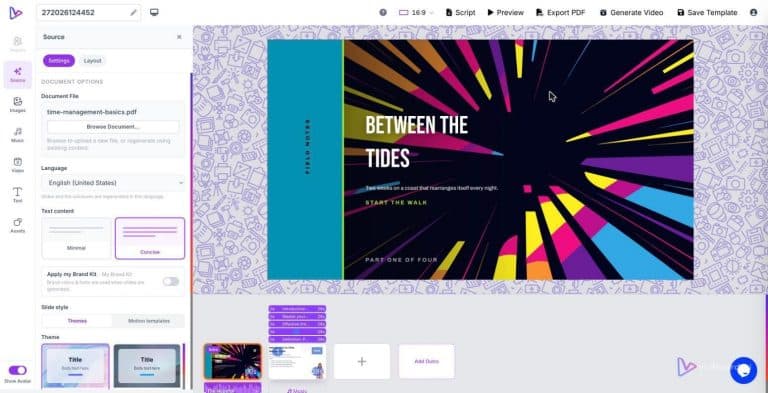
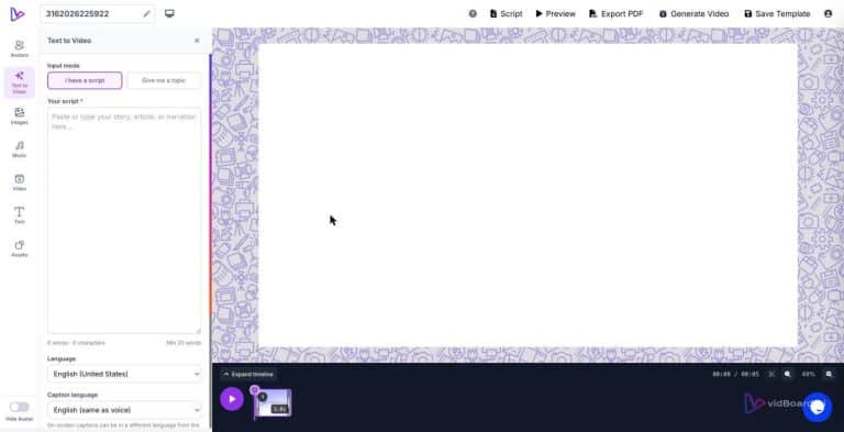
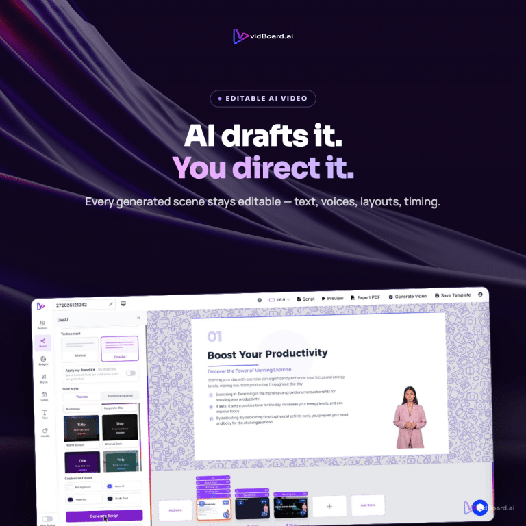
Designing separate treatments for each orientation can feel like triple the work — unless your editor treats orientation as a first-class variable. vidBoard is built around that idea: one project produces landscape, portrait and square outputs while keeping layout and content editable at the slide level. A few product features make the difference between lip-service and real control:
- Layouts that adapt, not crop: Each template in the library is available in all three orientations and AI-fill adapts content to the chosen layout. That means a template’s structure is reinterpreted, not simply sliced.
- Per-slide layout switching: You can change a slide’s layout independently of the rest of the deck so a slide that’s visual-heavy in landscape can use a different arrangement in portrait without rebuilding the project.
- Per-object timing and motion: Because text boxes, images and avatars remain editable with timing controls and entrance/exit animations, you can retune motion so it supports rather than obscures the message in each orientation.
- Brand Kit applied automatically: Colours, fonts and logos carry across every generated project, so design changes focus on composition and hierarchy rather than brand consistency.
- Template breadth and choice: With roughly 129 designs across motion templates and presentation layouts, you don’t have to invent a new visual language for vertical — you pick a template built to perform in that space and let the editor adapt your content.
Put simply: vidBoard treats the orientation switch as a creative decision inside the same workflow. You still start from the content you already have — a document, deck or link — but the output is not a single master that someone else has to customise by hand. The platform’s editable canvas lets you refine the vertical version (reflow text, reframe avatars, retime animations) while keeping the landscape original intact.
That approach is not just nicer; it’s practical. Teams converting course modules, blog archives or product decks save time because the engine applies brand and structure automatically, and creators keep control where it matters — the visual hierarchy, the voice and the pacing. The result is three videos that feel like originals in their intended context, not three crops of a compromise.