Motion that carries meaning in the vidBoard editor
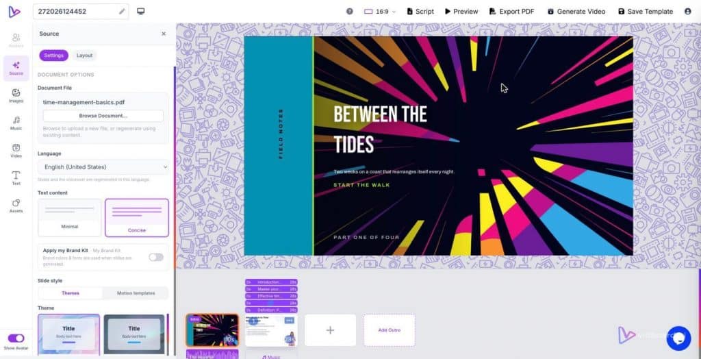
You drag a ten-page onboarding document into vidBoard, the platform splits it into slides, writes narration and places matching images. On the slide that lists the SLA metrics, a headline eases in while the key number holds a subtle pulse; when the narrator finishes, the stat slides away to make room for the next point. That choice — which elements move, when, and how — is not decorative. It’s the difference between a viewer who skims and a viewer who remembers.
Make motion an argument, not an ornament
Motion design should answer a communicative question: what should the viewer look at, and in what order? vidBoard gives you entrance and exit animations, continuous motion (float, drift, pulse, Ken Burns), and scene transitions so you can craft that answer. Used with intent, those tools do four things well.
- Establish hierarchy. Entrance animations tell an audience what to read first. A headline that slides in from the left sets the frame; a supporting stat that fades up afterward occupies the second position in the visual hierarchy.
- Hold attention on the key fact. Continuous motion — a gentle pulse or slow drift — highlights a single data point without shouting. Because the effect is continuous, it becomes a stable cue: this is what I should remember.
- Signal change of idea. Exit animations and scene transitions mark the end of one argument and the start of another. They keep a viewer oriented through a long explainer or course module without adding cognitive friction.
- Focus the eye in images. Ken Burns effects steer attention across a still photo, revealing detail in sequence rather than presenting every element at once.
Four motion levers and how to use them
Think of motion as four levers you can pull independently. Each lever has a clear production role; pull them deliberately.
- Entrance timing — Use entrance animations to sequence information. For a slide generated from a document or slide deck, reveal the frame-setting headline first, then bring in supporting bullets one at a time. That pacing matches how people listen: headline, example, consequence.
- Exit timing — Use exits to clear visual clutter and to reward forward motion. If a step-by-step process occupies several objects on a slide, fade out completed steps as you move through the narration so the next step stands alone.
- Continuous motion — Float, drift or pulse are background cues. Apply them to non-essential decoration sparingly, and to essential elements whenever you want gentle emphasis. A pulse on a call-to-action or a subtle drift on a product image keeps those elements alive without competing with voiceover.
- Scene transitions and Ken Burns — Transitions between scenes should reflect the relationship between ideas: a quick cut for tightly linked points, a slower dissolve for a conceptual pivot. Use Ken Burns on large photos to direct the viewer’s eye across an argument rather than forcing them to process everything at once.
Practical rules when editing in vidBoard
When you edit motion in the vidBoard canvas and timeline, aim for clarity and consistency rather than movement for its own sake. Our design rules — sans-serif typography only, nothing on a slide that does not carry meaning — map directly to motion choices.
- One purpose per motion. If an animation does not make the structure or meaning clearer, remove it. Motion that repeats across slides should carry the same purpose every time (e.g., all main headlines use the same entrance style).
- Match motion to narration. Because vidBoard produces a narrated first draft from documents, links and decks, align the animation to the voiceover. Entrance timings and per-object timing on the timeline let you sync visuals to what is being said so your motion supports the spoken structure.
- Regenerate selectively. Per-slide regenerate allows you to experiment with a single animated treatment without losing the rest of the project. Try a different entrance on your key stat slide, compare, and keep the one that improves comprehension.
- Use motion templates for consistency. vidBoard ships roughly 51 motion templates within a library of about 129 designs. Templates provide matched animation and music so you can apply a consistent motion language across landscape, portrait and square outputs without rebuilding each variant by hand.
- Reserve continuous motion for emphasis, not decoration. A slow float behind a headline can be calming; the same effect on every icon becomes visual noise. Keep continuous motion selective and meaningful.
These rules apply across the product’s strongest fits: course modules, explainers, marketing assets and internal comms. In e-learning, for example, entrance and exit timing help learners focus on one concept at a time. For social promos, a tight motion language preserves brand clarity when the same project becomes landscape, square and portrait.
Motion as production control
Motion is not an afterthought added in a final polish stage; in vidBoard it is part of production control. The editor’s per-object timing, entrance and exit animations, continuous motion options and scene transitions let you shape attention, pacing and memory from the moment your source material becomes a draft video. Treat motion as a communicative tool: choose movement that reduces cognitive load, reinforces hierarchy and matches the narration. When you do, each animated choice earns its place on the slide.